Creating a flexible feed
Building a growth experimentation platform to improve engagement and monetization

tldr
In this project, we tackled the issue of low home feed engagement by creating a feed that dynamically changes based on users’ actions on our site. We also worked on what we recommend to our users and also how our recommendations are represented on the feed. In order to make the feed changeable, I created new visual language for some of our key contents. This was adopted by other teams to make further impact.
My role
As the lead designer, I worked cross functionally with 1 Product managers, 5 developers, and 1 Product marketing manager in the same Palo Alto office. I also worked closely with 6 iOS and android developers in Tel Aviv office throughout this initiative. I was responsible for leading strategic brainstorm sessions, getting alignments, and was actively involved in roadmap settings, as well as coming up with designs.
Impact
We released the feed in 2 phases. In the first phase, we created a navigational based feed. Result was 6% increase in time on site. With this results, we are moving towards the 2nd phase where we create content based feed. Besides immediate improvement in feed results, this project led to cross team adoption of new visual language, and led to quicker design process for other teams.
BUSINESS CHALLENGE
Houzz is a one stop shop for all things related to home renovation. It offers three unique services for its users: inspirational interior design photos combined with rich forum discussions, e-commerce to purchase products, and a vast network of pros to support all home renovation needs. All of these offerings are featured on its home feed.
However, users were bouncing and not engaging with the home feed on both mobile and web. So, as the project lead, I dug into this challenge to identify why users weren’t engaging with the home feed, and how we could redesign the home feed.
Context Gathering
When we kicked off this project, I started by understanding how the home feed evolved to its state at the time. This way I could understand past learnings and determine what I should consider preserving, and what I could change and test.
In the slideshow below, you can see that the feed was originally content focused.
Over time, the monetization efforts led to the addition of a card that directed users to monetized sections of the site: e-commerce and pro directory.
Adding a monetization card into the content improved the Gross Merchandize Value (GMV) generated from the page. So, a decision was made to surface even more monetization content on the page by introducing double shop carousels and pro carousels on top of the card feed.


Problem Identification
After adding monetization modules to the home feed, the team shifted focus to a new challenge: low engagement with the feed. An analyst had informed the team that the bounce rate from the feed was high and there was low interaction with content on desktop. In order to better understand the data, I worked with the Analyst to dig into the engagement data for the feed on both web and app.
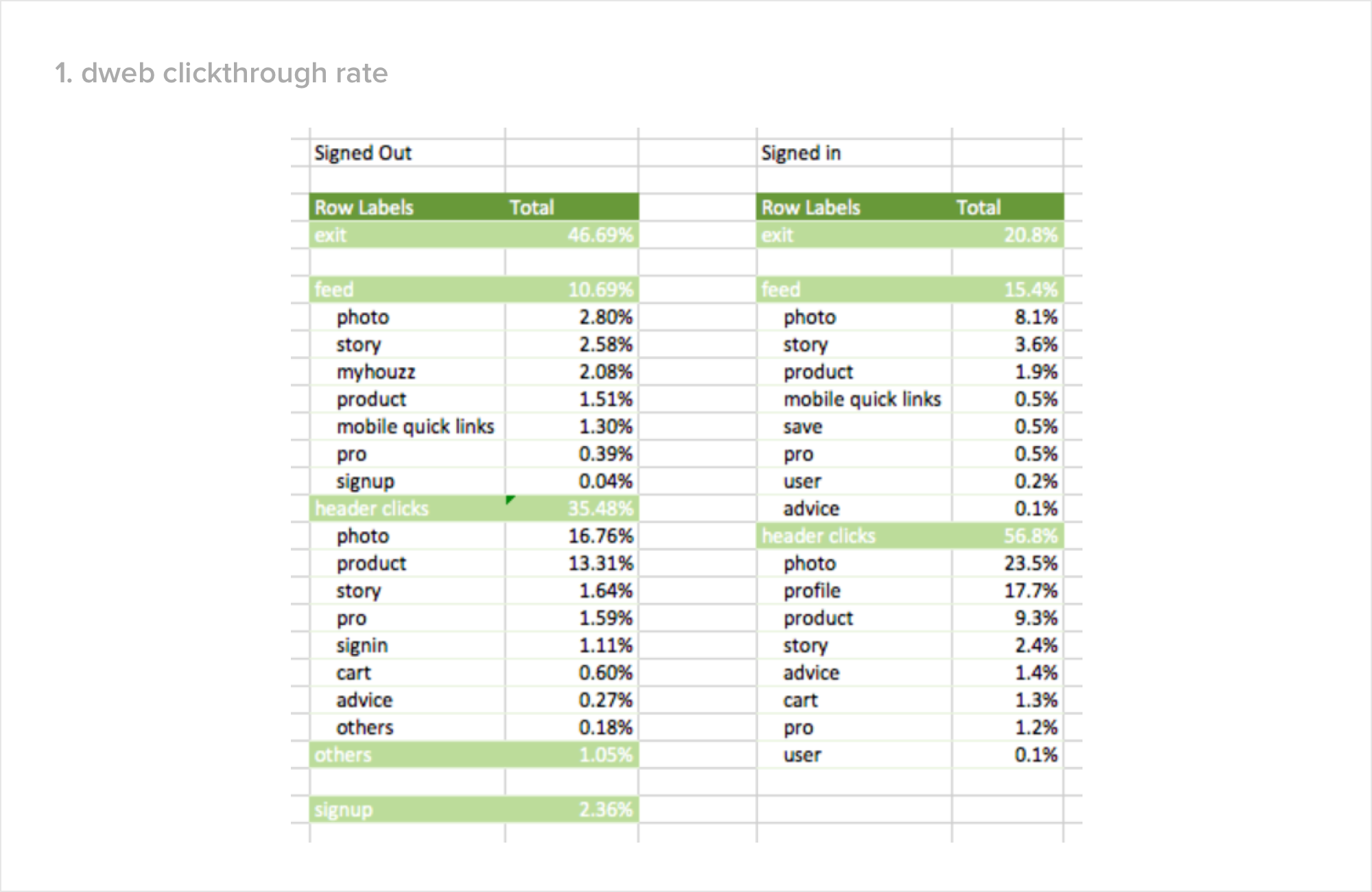


First, we looked at the web clickthrough data on the home feed. Next, we looked at the app scroll and click through data on the home feed. What became clear was that there was low engagement with the feed on both desktop and app. Specifically, it looked like this for most most users:

To understand why there was low engagement specifically with the cards on the feed, I conducted several user studies and came to understand that unsurprisingly, users weren’t engaging with the cards because they didn’t find them relevant.
For instance, a user might have been interested in purchasing a chair on her last visit, but today she might be interested in couches. However, when she’s on the feed, she doesn’t find any relevant content for her new needs. Instead of the couch, we’re recommending a chair based on her previous visit.
This led me to want to better understand how our recommendation algorithm works. I talked to the Research team and found out that the feed content is based on user history. For example, if the user sees a farmhouse dining room photo, we recommend farmhouse products and farmhouse photos.

However from the user studies I conducted, I knew that the content that a user wants to see changes over time. Therefore, our recommendations weren’t keeping up with our users’ needs over time. What’s more, on our mobile experience, we only showed one recommendation at a time in the form of a tall card. This meant that we were not surfacing many recommendations, lowering our chances of providing a relevant recommendation.
Design challenge
How can we improve home feed engagement by designing a feed that is relevant, given how little we know about users?
DESIGN STRATEGY
I started my design process by defining the scope of the project. I knew that there was little we could do to change the on-boarding process because one of our use cases is e-commerce, and adding any friction to the sign up flow would impact our monetization efforts.
So I focused on understanding how home feeds work across various sites. I found that most sites either have a navigation flow or a content feed. I then identified pros and cons for either option.
In terms of pros, navigation flows offer broader category entry points for users, and gives control to the user, meaning there is a higher probability of us surfacing relevant content for the user. On the other hand, a content feed, when it’s relevant, is lot more engaging for users because they can find inspiration in the same vein of what they are looking for.
In terms of cons, navigation flows are static, and not very interesting for users. However, a content feed is risky for us because our recommendations had proven to be not very relevant for users due to us not having enough information about them.

After much consideration and research, I decided that a blended approach would offer the best user experience. I chose to design a home feed that offers users the ability to navigate to specific categories, but that would also provide content by category for easy browsing.
Next, I needed to identify nav and content categories. So I dug deeper into understanding users’ use cases on Houzz (browsing photos, shopping products, browsing professionals), and also how a home remodeler would transition across different user states through generative user interviews. I then developed a list of different nav and content categories based on what I learned.

Design Execution
I worked with a PM to create a 2-phased plan for the home feed.
During Phase 1, we focused on developing a scalable experiment platform and consistent design guidelines that would allow us to quickly and easily test personalized recommendations in Phase 2.
Success for Phase 1 was to lay down the foundation for future experimentation by making changes to the existing home feed design without breaking anything. While building this, it also provided time for our engineering team to start developing a personalization algorithm.
During Phase 2, the plan is to leverage the foundation built in Phase 1 and run personalized experiments to provide more relevant content to users. Phase 2 is when we hope to see marked improvements in engagement and monetization.
Phase 1: Layout Design Considerations
I started by exploring different layouts and realized that when it comes to a recommendation feed, there are four primary types of layouts.
Large single card format: Provides users with large visuals, which is the best experience if the recommendation is good. However, if the recommendation is bad, this experience offers a bad experience as it takes up a whole screen to recommend an irrelevant visual or content category
Grid format: Offers a great scrollable experience for users, and is a good experience if a user wants to see a selection of similar content. However if the recommendation is bad, it’s an experience that traps users as the grid takes up a large amount of screen real estate.
Carousel: Allows users the ability to compare relevant types of content/navigation, and uses minimal vertical real estate which means it’s possible to squeeze in two carousels in the similar vertical real estate that a large card, or grid usually takes up. Downside of a carousel is that if the user enjoys the content, it’s not the most immersive experience. Each card within the carousel is relatively smaller than if they were to have it in the form of cards.
List: Shows multiple types of content categories stacked on top of each other while also being very legible. However the downside of a list format is that it’s not really possible to have this experience for single pieces of content that don’t nest easily under a broader category. It’s also less visually appealing for users to interact with.
From these four options, I realized that the carousel format offered the highest probability of relevant recommendations for Houzz, as it allows us to show multiple categories at once. Being able to show multiple content categories on one screen meant that we could also feature discovery carousels alongside monetized carousels with products on one page. And a strong indicator for user engagement with carousels came from our existing home feed design - the carousels at the top of the page had the most engagement.
However, it also meant that we would need make a drastic change to the existing home feed: cutting the endless scroll of large cards. Given user engagement with the existing home feed was low, we felt confident that users didn’t actually find a lot of value in the endless scroll and hoped that our results would prove our hypothesis correct.
Visual Design Considerations
With the decision made to use a carousel layout, I moved onto the visuals. I started by collecting how we represent different types of information on Houzz. I realized that existing visuals varied a lot in appearance, even when the layout was the same. With rapid experimentation, inconsistent visuals would become more apparent, and hence I needed to create a new visual standard to ensure consistency. This would not only help scale experimentation, but would also provided for a better and more consistent brand experience for users.
As I created the new visual standard, I kept several considerations in mind to make sure that the design guidelines I created could benefit other designers as well.
Consistent width and height. Given that our strategy with the feed was all about experimentation, I realized that we needed to standardize the format for content to achieve consistent user and brand experience. For example, if there were two carousels of two different content types, and each had different vertical height and width, with personalization the page could look very different depending on which one came first. This could lead to a very jarring experience for the user.
Differentiation between categories and content. In the new design, a row of content categories could appear above or below a row of individual pieces of content. I needed to come up with a way to differentiate the two so that a user could understand whether or not they were clicking to expand a single piece of content, or if they were clicking to navigate to a content category.
Scalability across different screen sizes. For each card within a carousel, I also worked to ensure that cards could grow or shrink in terms of size, to look consistent across both mobile and web.
phase 1 Output
Phase 1 Test results
When we released the newly updated homefeed, we saw extremely positive metrics on both mobile web and desktop web:
Desktop web:
+4.3% time on site
-7.4% bounce rate
+6.8% more photo browse
+3.1% more product browse
+7.3% more stories browse
+7.5% more contact to professionals
Mobile web:
+10% time on site
-22% bounce rate
+11% more photo browse
+18% more stories browse
+50% more contact to professionals
Given the success of this phase, we shipped this feature to 100%, and moving towards phase 2 of the plan.
Additional Impact
Besides the immediate results from the feed, perhaps the most significant result from the project was getting the design team’s alignment on the new visual language, getting the same UI adopted by different teams, and helping other projects move quicker.

