Fanatics Rewards Site Design
leveraging quantitative insights and analysis to redesign a rewards site

Year
2015
Role
Lead UX designer
Timeframe
2 months
Business challenge
Fanatics' Marketing team kicked off an initiative to vastly revamp the existing rewards program. As part of this initiative, they wanted to redesign the rewards landing page and approached me to lead the design and product roadmap. I worked cross - functionally with Marketing, front-end engineers, and back-end engineers to define the business challenge, identify the design objectives, and create and execute against a 6-week roadmap to redesign the rewards program site.
Insights to problem definition
understanding the business objectives
I kicked off the design process by researching popular retail rewards programs to better understand both how they're structured and how their sites are designed. After conducting competitive analysis, generative user interviews, and brainstorming sessions, I met with the marketing team to understand their business objectives. I presented variations of rewards programs to lead an open brainstorm on our short and long term goals. This enabled me to create a roadmap that would both meet the immediate business needs and also scale for future needs.
The immediate goals outlined by the Marketing team were twofold:
Add more information about the benefits of joining our rewards program
Showcase past rewards winners
In the future, they wanted to add three additional elements to our rewards program:
Create a tiering system for members
Allow members to choose when to apply rewards discounts (rather than the current system which automatically applies their earned discounts towards their next purchase)
Scale the program across all partners
Generating insights to define design challenge
Before redesigning the rewards site, I wanted to first understand the pain points in the existing site so that I could alleviate them in my new design proposal. The Marketing team had identified that the overall signup rate to join the rewards program was low, but didn't know why. So I worked closely with the Analytics team, asking targeted questions, to understand where and why the conversion rates were low.
I first noticed that the rewards home page was getting low traffic. Also, the conversion to the 'sign up' page was again low. In other words, we were doing a poor job of getting users to the rewards page, and the rewards page was ineffective at getting users to sign up for the program.
To understand why, I dug in further:
I found that 71% of the traffic to the rewards page was coming from mobile.
However, this seemed strange to me because ~60% of traffic on the home page came from desktop.
So I looked at the possible ways to come to the rewards page, and found two primary ways: from our site's home page or from email campaigns.
Looking at traffic from email vs home page, I found that 77% of the traffic was from email.
Lastly, I looked at the clickthrough and open rates for the rewards program email and found that it was one of the highest performing emails sent by our Marketing team.
Combining all this data painted a clear picture for me: the majority of visitors to our rewards page come after seeing an attractive email while they're on the phone. Therefore, they're highly intent in signing up to the program but don't.
This understanding led to several questions:
Why was the majority of the traffic coming to the rewards page from email?
What was wrong with the existing links from the home page?
Why were high intent users from email not completing the sign up process to join the rewards program?
And ultimately, helped me define my design challenge: How do we increase the traffic to the rewards page on desktop and mobile, and improve the sign up conversion to the rewards program while still meeting the business needs defined by Marketing?
Analyzing rewards page to sign up page conversion
With these questions in mind, I conducted a quick guerilla test to see how people find the rewards page from the home page. I found that 1 out of 10 participants found the link on mobile, while 9 out of 10 participants found the link on desktop. Combining these results with the fact that % of traffic from home page was low, I came to the conclusion that the rewards link on mobile was difficult to find, and rewards link on desktop was not appealing enough.
Then, I set out to understand why visitors weren't converting to members. I split the traffic by mobile vs desktop to see which was worse. Data showed me that mobile conversion was ~30ppt worse than the desktop conversion. Mobile had a 69% drop in conversion from rewards page to sign up, while desktop had a 41% drop.
To understand why mobile conversion was lower than desktop, I conducted usability tests on both mobile and desktop. I tested whether users understood the benefits of the rewards program after reading the rewards page for 20 seconds. (I chose 20 seconds because stats show that around 90% of users bounce off of a page after 20 seconds). I found that users had difficulty scanning and understanding our rewards page, and therefore didn't understand the benefits of signing up for our rewards program. These pain points are accentuated on mobile, because the page is long.
Lastly, I wanted to understand if the existing 'rewards program' was attractive to our users. So in a separate test with similar personas, I tested whether the users were interested in signing up to the exact program we're offering by showing a quick dummy prototype that better explained what we're offering. From testing with 10 users, I came to find that 100% of users wanted to sign up. This was a stark contrast to the 69% drop in conversion from the rewards page to sign up. What this indicated was that the problem was not about the attractiveness of our rewards program. Rather, the problem was all about the design of our rewards landing page.
Design Goals
increase traffic to rewards page
simplify the design to better communicate the benefits of the rewards program
increase engagement from existing users
increase sign up conversion
Design Process
DEFINE success metrics and opportunities
Now with a clearly defined problem and goals, I kicked off my design process to determine potential directions:
First, I translated the design goals to measurable metrics, so I design with a target in mind.
Increase traffic to rewards page: measured by % of visitor to rewards page from home page
Simplifying the design to better communicate the benefits of the rewards program: measured by usability testing results
increase sign up conversion: measured by % change in signup conversion
Second, I mapped out the current user journey, and ideal scenarios for new users and existing users, so that I could find opportunities to meet design goals.


Third, I met with developers to understand technical constraints. I came to learn that the rewards page cannot support javascript, and learned about how we identify rewards members on our back-end. These impacted my design decisions because I would not able to put a 'signup box' on the rewards page.
Lastly, based on these steps, I identified opportunities to meet the design objectives:
Insert simple and clear information about the rewards page throughout the shopping journey
Create rewards section that clearly explains the benefits of the program
Design mobile first
SKETCHING TO PROTOTYPING TO FINAL RECOMMENDATION
With these in mind, I executed design by quickly going from sketching to prototypes. And in an iterative process, I conducted numerous usability tests to get to the right experience.
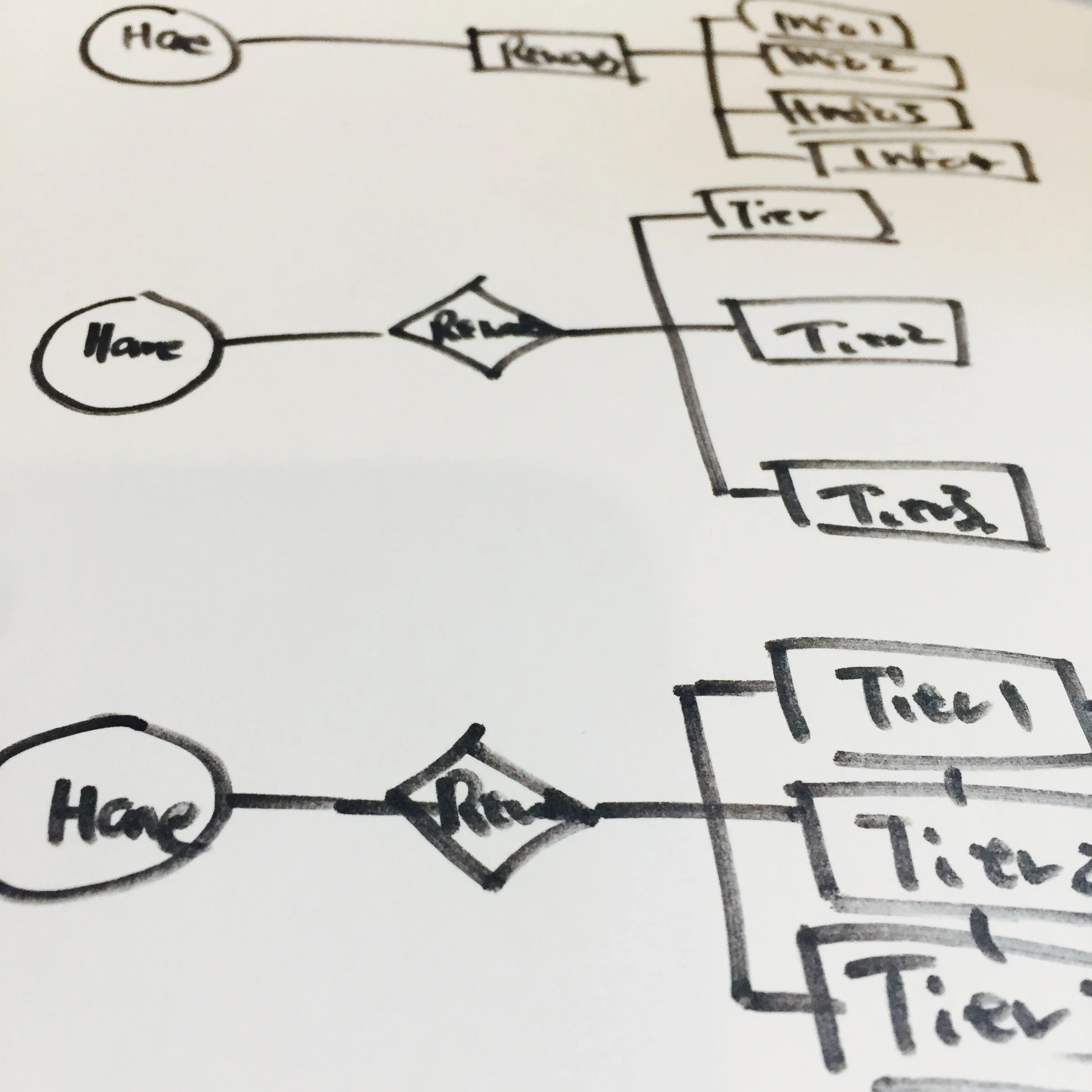

1. Sketch flow charts
I iterated on multiple flow charts and mapped out all the possible user journeys that the user can take, and also the most optimal solution for them to reach the product, based on findings from user interviews.
2. Create wireframes to illustrate and choose design direction
I synthesized ideas into design directions and explained our choice to stakeholders. At this stage I used wireframes to avoid potential distraction from visuals.

3. Build high fidelity mockups
Once a direction was chosen, I turned the wireframes into high fidelity mockups. Behind each design decision, there were multiple alternative assets.
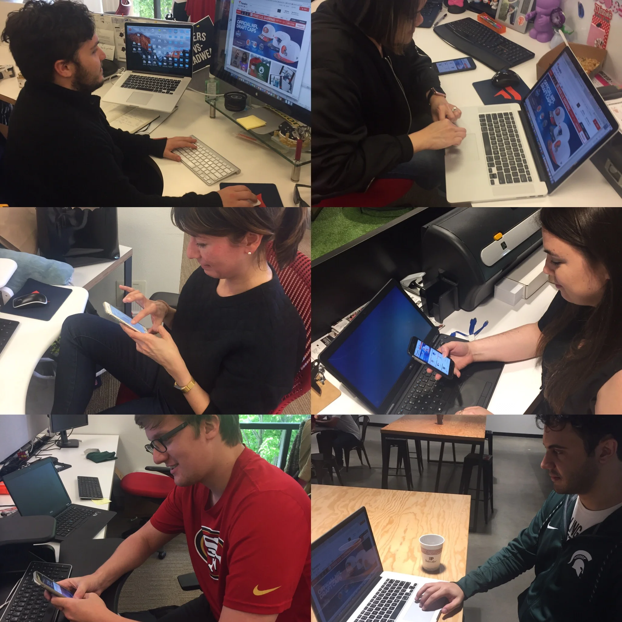
4. Test with users and iterate
Key design decisions before the release always involved talking to users. I used dump & sort techniques to quickly identify pain points, and move forward with design choices.